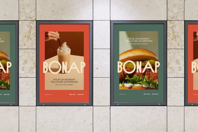
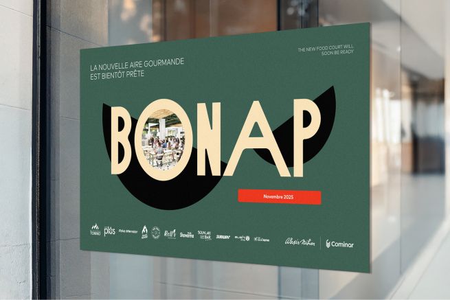
bonap: A Tasty Identity, A Bold Business Vision
With bonap, Cominar wanted to create much more than a catchy name or a polished visual identity. The goal was to build a brand that feels contemporary, vibrant, and confident. A brand that reflects the unique experience, design, and atmosphere of Alexis Nihon, while playing a strategic role in elevating the centre and the complex.
“Creating this brand is, above all, a business imperative. What we want is to boost awareness, spark excitement that drives traffic, and ultimately generate sales,” explains Sandra Lécuyer, Chief Culture and Brand Officer at Cominar.
The Result of a Collective Effort
This brand strategy was shaped through rich, thoughtful collaboration. By bringing together strategic expertise—design, marketing, construction, leasing—we defined the creative mandate and evolved the vision to deliver a distinctive, meaningful identity.
Once the creative work was complete, the teams involved embraced the brand and helped propel it across the organization and into the community.
Conceived and crafted 100% by our in-house creative talent, bonap naturally integrates with our existing brands while reflecting the new space it represents and the unique experience it offers.

A Name That Feels Familiar
bonap evokes warm, casual moments shared around the table—the joy of eating, and more importantly, of connecting. Inspired by a familiar, friendly expression, it speaks to the simple, universal pleasure of enjoying good food in good company.
Short, catchy, and easy to remember, bonap reflects both the conviviality of the space and the quality of its food offering. It embodies authenticity, closeness, and friendliness—values at the heart of the customer experience at Alexis Nihon.
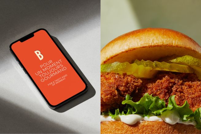
A Cohesive Tagline: “A Tasty Kind of Moment”
The tagline celebrates the pleasure of good food, the central element of the brand. It builds on Cominar’s promise— “1001 memorable moments” —by adding a flavourful, warm, and accessible dimension.
It reflects the richness of experiences offered in the new food court and the diversity of moments everyone can enjoy there.
The Logo: Simple, Modern, and Appetizing
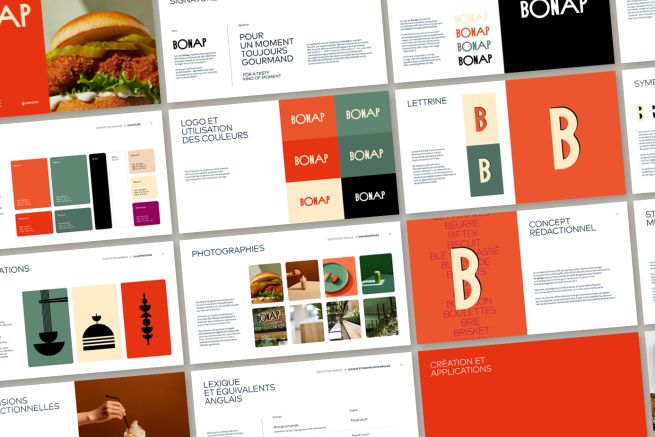
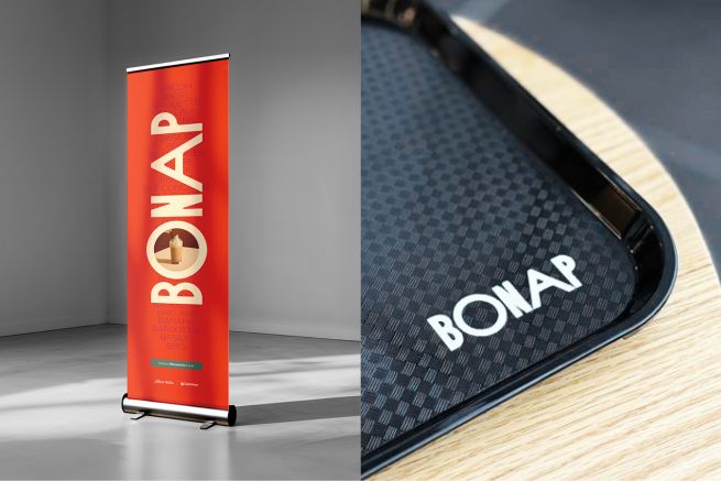
The bonap logo is both timeless and modern, with a bold yet approachable character. Rounded corners bring softness, while wide serifs add presence and personality.
The amplified “O” evokes the shared plates of the food court, and the counterforms of the “B” visually recall meal bowls—a direct nod to the generous, complete dishes served on site. Combined with a colourful, appetizing palette, the logo creates a visual signature perfectly aligned with the space’s design.
The B: A Welcoming, Unifying Symbol
As the first letter of the food court’s name, the B naturally became the central concept. Its rounded shape suggests warmth, hospitality, and friendliness—echoing words like “bonjour” and “bienvenue.”
It inspires the visual platform, the symbol system, and a strong editorial approach that showcases the food offering.
The Drop Cap
Always used in double thickness, it expresses generosity and abundance while adding distinctive visual energy.
The Symbols
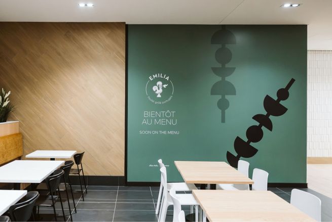
Geometric shapes derived from the drop cap—sometimes layered or broken apart—suggest two meal bowls: a direct nod to popular, comforting quick-service dishes. This representation reinforces ideas of generosity, sharing, and connection, all within a contemporary, inviting aesthetic.
The “B” Words
The concept of “B” words extends the brand, making it tangible, lively, and playful. Drawn from bonap restaurant menus, these words can be used in tone-on-tone effects to illustrate the variety of experiences: baguette moment, bowl moment, bagel moment, and more.
They also help animate promotional campaigns, spotlight specific restaurants, and adapt to new offerings.
A Brand That Inspires Pride
With bonap, Cominar brings to life a brand that feeds both appetite and imagination. A strong brand, capable of attracting, inspiring, and creating true community attachment.
A brand that is, above all, deeply human—and one we’re all proud of.
